

Many organizations across various industries use data visualization for a variety of purposes. When it comes to your WordPress blog, visualizing data can help you support your content with evidence.
Data visualization not only provides added depth to your content but improves the user experience by making the information easy to consume.
Complimenting your content with a variety of images and data visualizations makes your content easier to read and more engaging for audiences. By breaking up blocks of text and breaking down complicated data, you encourage your users to do what comes naturally – skim.
But skimming doesn’t mean less retention. Studies show that people only remember 10% of the information they hear after three days. However, when you pair that information with an image, that percentage increases to 65%!
The easiest way to incorporate data visualization is by using a WordPress data visualization plugin. We’ll look at why you should use a data visualization plugin and some of the different data visualizations you can generate with them.
Then we’ll look at our six favorite data visualization plugins and how you can use them to improve your user experience.
Effortlessly export your Google Docs to WordPress with just 1-click.
Get Started Today
Data visualization involves taking data and representing it graphically or pictorially. Doing this makes viewing and analyzing datasets easier.

WordPress is a top-rated platform for building websites and distributing content on the internet. In fact, 43.2% of all websites in the world use WordPress.
It’s an open-source content management system (CMS). “Open-source” means anyone can install, use, and modify it for free, which is perfect for those who don’t have a high level of coding experience.
Because it’s open-source, many user-made plugins can add functionality to WordPress sites. There are plugins specifically designed for data visualization. You can create various graphs, charts, maps, and more to complement your content through these plugins. Also, ensure secure multicloud data management to protect sensitive information while utilizing such plugins.
This flexibility has made WordPress a go-to platform for bloggers and professionals who work with data regularly. As content becomes increasingly data-driven, many creators look for ways to present information clearly without overwhelming readers. Whether you’re visualizing survey results or publishing technical insights, the tools you use matter. Beyond WordPress, data visualization is also fundamental to professional data workflows. Many data specialists use dedicated data science tools to handle everything from data preparation to insightful visual reporting across more complex environments.
Data visualization makes it easier for people to understand large or complicated datasets. For example, we process information faster in a visual format than in spreadsheets. So, displaying data in a graph or chart makes it easier to understand what the data is telling us.
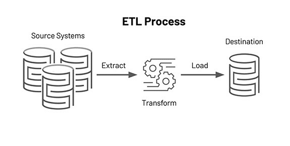
The same is true when explaining complex processes. For example, if you’re a data company writing an article to answer the question, “What is extract transform load?” a data visualization might look like this:
Data visualization makes complex data accessible to everyone. So consider using a data visualization plugin for your website to improve user experience.
Let’s explore the different types of data visualization you can use on your WordPress blog. Choose the best one for your data and audience.
Charts or graphs provide a way to simply but effectively show different data types.
There’s a graph or chart to suit every need:
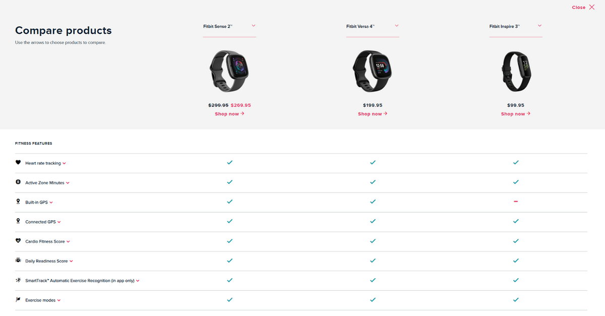
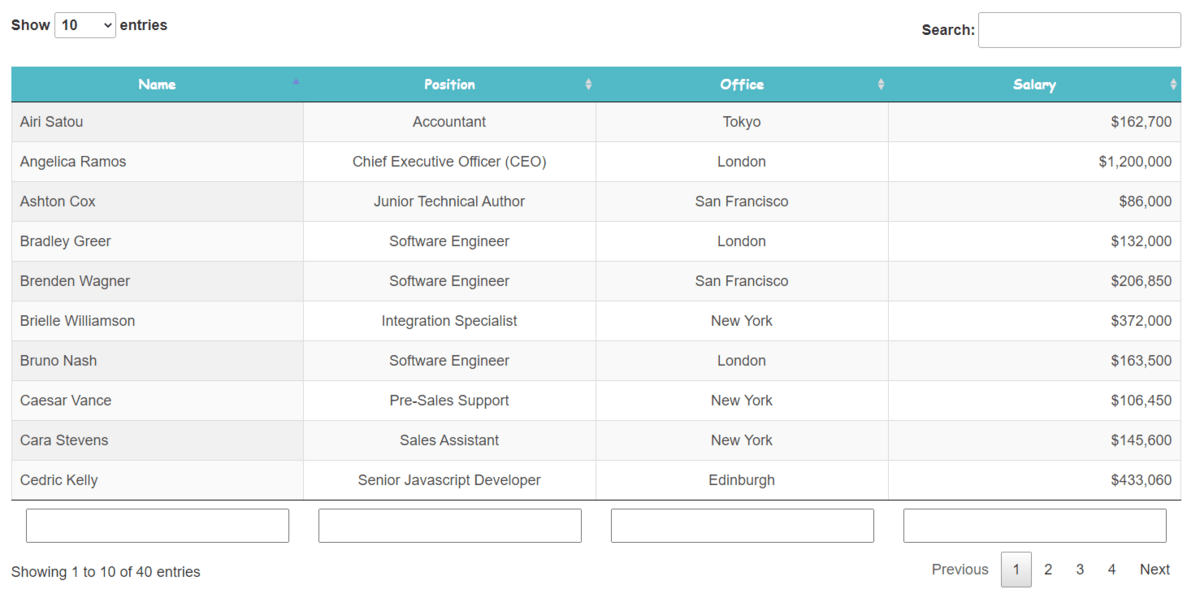
Tables are a clear and concise way to display data for easy comparison. Many e-commerce businesses use comparison tables to show different product features. It allows customers to feel like they’re making a more informed choice. They can clearly see each product or service’s benefits and differences.
Tables aren’t only used to compare products and services. They’re also useful when displaying large datasets because they allow for the easy scanning and searching of information.
Maps can be handy for visualizing data to highlight information about a specific area. They can also show how data changes by location. Make sure to install the map plugin for WordPress so you can gather all this data.
Bubble maps feature numerous “bubbles” overlaid on a geographical map. Each bubble varies in size according to the data point they represent. This provides a way of visually displaying data that’s immediately easy to understand.
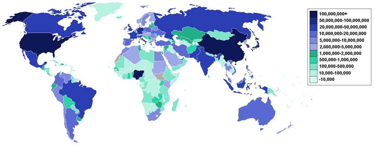
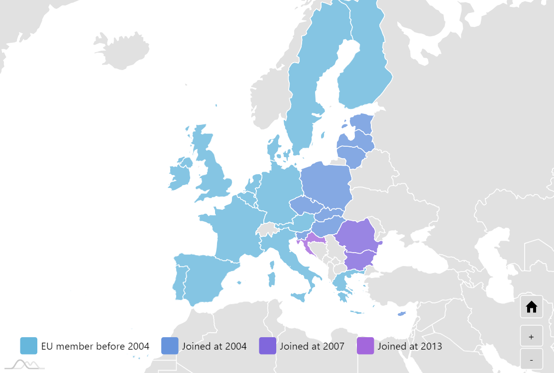
Choropleth maps make use of color to highlight geographical differences in datasets. Often, shades of the same or similar colors demonstrate how data points differ by area. Generally, darker colors represent more data points, and lighter colors represent fewer results.
In the example below, darker shades of blue demonstrate areas with the highest concentration of internet users. Whereas the paler shades of green show areas with fewer internet users.
Timelines can show how data has changed over time in a more visually pleasing manner than a line graph. Images, colors, and other features can customize maps to make them stand out and engage the reader.
It’s also possible to use timelines for other purposes. For example, you can use it to lay out the project schedule or show your business’s story.
If you’re looking for a way to tell a visual story with your data, then infographics are the way to go.
They provide an immersive method for sharing information with visitors to your blog or website, using images, colors, and the layout of information to creatively tell the story of your data.

If you want to add some movement to your blog post, you can use an animation generator to create eye-catching animations that help visualize your data. The complexity of the animation can vary greatly. From bars on a graph that change in size as you view the image to a spinning globe that displays annotations as it spins.
Animations can engage your audience and open up many new avenues for exploring data. However, it’s worth remembering that too many or too complex animations can slow down your website’s load time.
Now that we know what kind of data visualizations are possible, it’s time to look at some of the plugins you can use to generate them.
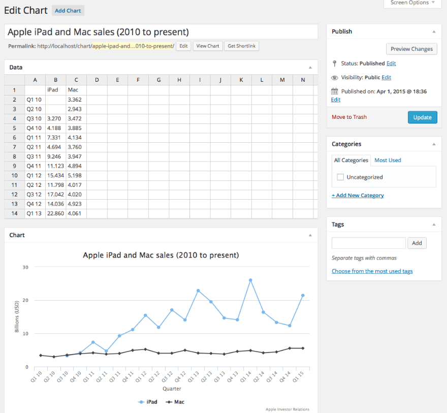
Visualizer allows you to generate a whole range of charts and tables to add a touch of style to your data. The tables and graphs are fully customizable, allowing you to create interactive and responsive visualizations.
Add data manually or import from third-party sources. Then, you can apply it to a wide range of templates to create unique visualizations.
Four different chart types are available as part of the free version:
A further 11 charts are available in the Pro version, including:
The Pro version also allows you to synchronize data periodically and allows visitors to edit charts where desired.
iChart is another data visualization plugin that allows you to build a range of charts and graphs.
The included chart builder guides you through building graphs, allowing you to customize as you go. iChart also makes it easy to preview how your charts will look on various browsers and devices, so you can make sure all your content is mobile-friendly and responsive
The free version of iChart gives you the ability to make several different charts, including:
A paid Pro version is also available, which gives you a wealth of further customization options and the ability to create additional charts such as GeoCharts.
There’s no need to hire Python developers or use an AI script generator to code your website here. Website owners of any technical expertise can add charts and graphs to their websites with the built-in shortcode generator.
If you want a data visualization tool that lets you work from a spreadsheet interface, look no further than M Chart.
The built-in spreadsheet editor is perfect for using data from your spreadsheets in Microsoft Excel or Google Sheets. You simply copy and paste what you need into the plugin.
Once you’ve entered your data, you can use it to generate various charts, then use the shortcode generator to drop it straight into the content you’re creating.
Generate various charts and graphs using M Chart, including:
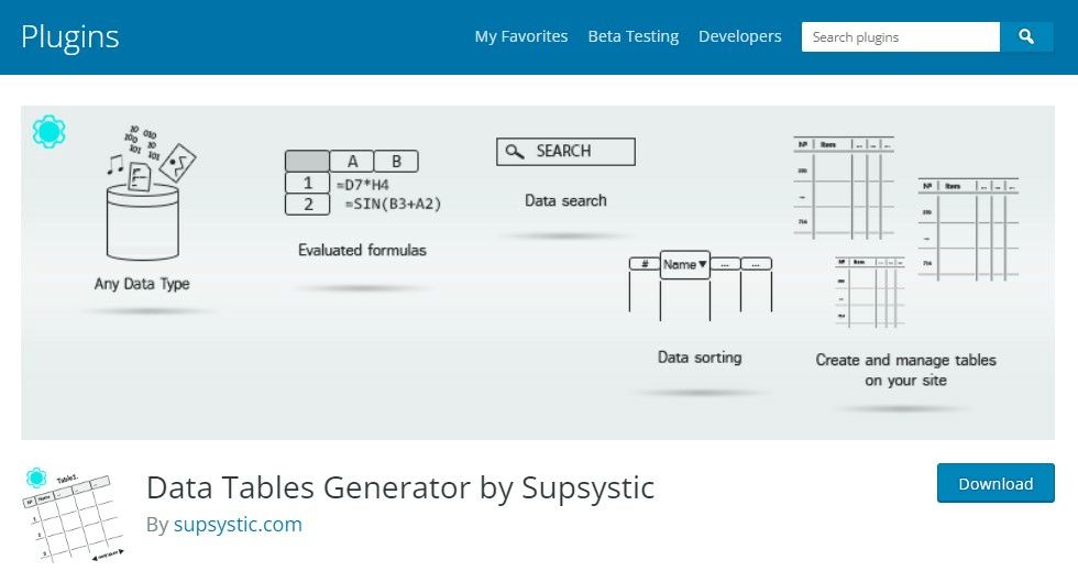
Data Tables Generator by Supsystic makes it easy to generate responsive charts and tables. This allows viewers to interact with the data and grasp what it says.
Display your data in easy-to-read tables regardless of the size of the dataset. With the Pro version, you can even import data straight from Google Sheets and Microsoft Excel.
What’s more, through integration with WooCommerce, you can create searchable, filterable product tables for your e-commerce store, complete with quantity and add-to-cart buttons.
The free version of Data Tables Generator only allows you to create tables. However, with the Pro version, you can create a range of graphs and charts using your data.
amCharts: Charts and Maps is slightly different from most of the other plugins listed here, as it also allows you to create maps alongside charts and graphs.
The amCharts WordPress plugin is free but designed to work in orchestration with the amCharts software.
The plugin itself doesn’t actually contain a native chart builder. Instead, it relies on amCharts software to create charts and maps. Then it uses HTML or JavaScript code to implement it.
However, the upside of using external software to create charts is that you can build more complex data visualizations than most other WordPress plugins can handle.
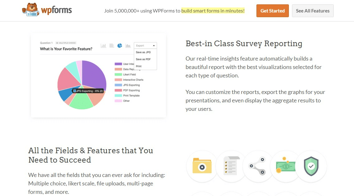
WPForms is chiefly a drag-and-drop WordPress contact form builder. However, it also has several data visualization options worth mentioning on this list.
With WPForms, you can create surveys and polls, embed them onto your blog and website, and then visualize the results once they’re complete. So whether you’re blogging about monorails or monolithic architecture, you can engage your audience and make them part of your content.
This provides a great way to engage your audience in your content further, as they’re directly contributing to it. The real-time insights feature automatically builds reports based on collected survey data. You can customize these reports and graphs and export them as required.
Users are looking for answers to questions and easy-to-understand information. If your blog ticks these boxes for your visitors (and Google), you’ll rank higher in searches, and users will enjoy their experience.
As a result, users will show their love with more traffic and more engagement.
Using a data visualization plugin is the simplest way to build charts, graphs, maps, infographics, and more. By adding depth and value to your blog with these data visualizations, you’ll show that you prioritize user experience and keep them returning for more.