

If your WordPress user experience is leaking visitors, engagement, or conversions, you’re leaving traffic and revenue on the table. In this article, we dive into six of the top front-end complaints. These are user-experience issues that real site visitors feel.
We’ll show you what these problems are, why they happen, and how to fix each one. Implement these fixes, and you’ll convert these WordPress user experience complaints to improvements in conversion rates and bounce rates.
You built your WordPress website to be your digital storefront. Your visitors rely on it to have a pleasant experience just as they would a customer service representative in a brick-and-mortar store. That’s why it’s imperative that you keep your WordPress site running smoothly.
Let’s explore the top six ways to ensure your users have a great experience and your brand’s reputation grows accordingly.
Visitors click, wait, and leave. That’s the reality when a WordPress site loads slowly, shifts content unexpectedly, or lags when someone tries to interact.
The screen jumps. Buttons don’t respond fast enough. Images load late.
When this happens, visitors already form a bad impression before they’ve seen your message. If you notice rising bounce rates or shrinking session lengths, this could be the problem.
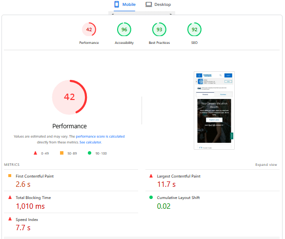
Core web vitals (e.g., largest contentful paint (LCP) and cumulative layout shift (CLS)) are not optional metrics.
These are the ways browsers, Google, and users perceive speed and stability.
Slow loading times and content that shifts increase frustration. This makes it more likely that visitors will bounce and instead land on competitor sites.
Fast loading and interactivity mean users see content quickly, and navigation feels more intuitive. This enhances the user experience. As a result, visitors are more likely to stay on your website and become email subscribers or new customers.
This is why mobile experience is so important and should be part of your SEO checklist.
Here’s an example of a PageSpeed Insights report:
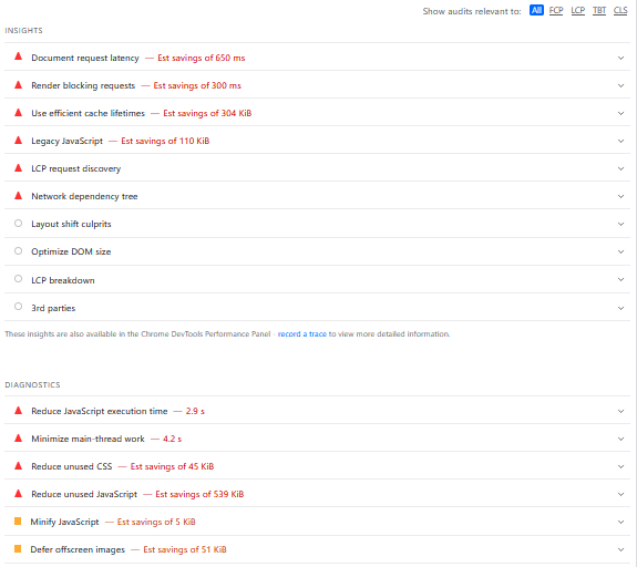
Underneath the report, Google provides you with insights and diagnostics that help you pinpoint what’s causing the slow speed or layout shifts:
When someone lands and can’t find what they came for, they get frustrated. Too many menu items, vague labels, buried content, or a header that changes unpredictably leave users guessing.
They don’t feel in control. They click aimlessly, get lost, and bounce. That confusion hinders exploration, dilutes CTAs, and makes even interested visitors hesitate.
Navigation is the map and compass for your audience. If it’s cluttered or mismatched with their expectations, they waste mental energy trying to decode it.
Jakob Nielsen’s usability heuristics call out clarity, user control, and recognition over recall. Overloaded or poorly labeled navigation violates all of those.
When people have to interpret your menu instead of instantly understanding where to go, you add cognitive friction. That friction costs clicks, lowers conversion rates, and reduces the likelihood that someone digs deeper.
Simplifying the structure for a better WordPress user experience reduces cognitive and memory load. It allows your visitors to flow through your website and focus on what’s important.
This creates smoother journeys, which can lead to higher engagement and conversion rates.
This focus on user experience and customer intent is the core of the new SEO meaning in 2025.
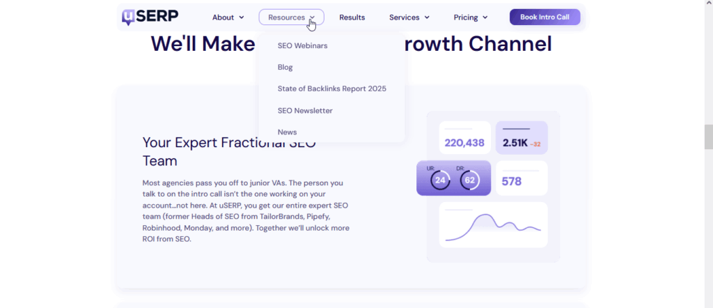
For example, here’s how uSERP, an SEO content and backlinking agency, uses a simple sticky header:
On a phone, your site should feel like it was built for that screen.
But if visitors see overlapping sections, unreadable text, tiny buttons, or have to pinch and zoom, they tend to give up.
The site looks unprofessional. They have to work to understand, tap the wrong things, or bail. And that’s a majority of your traffic getting annoyed because the layout doesn’t adjust.
According to GlobalStats research, mobile market share is nearly 60% worldwide. Not optimizing for mobile means losing over half your potential audience before they even engage.
For example, here’s what our website looks like on the Samsung Galaxy S20+:

Many WordPress sites look good to sighted, non-disabled users but break down for others. People using screen readers, keyboard navigation, or with visual impairments often find that websites are not accessible enough.
Images without ALT text become silent blanks. Headings aren’t structured, so assistive tech can’t convey hierarchy. Low color contrast hides text. And for color-blind users, similar shades of different colors, like green and red, tend to look the same.
An inaccessible WordPress user experience means a chunk of your traffic can’t access or trust your content. They leave, with no feedback, just a lost opportunity.
Excluding people isn’t just a moral miss. It’s a business one.
Accessibility gaps shrink your reachable audience, damage brand trust, and in some regions even create legal risk.
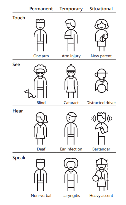
Failing to account for accessibility means you’re also missing out on audiences with temporary or situational limitations. These include people with arm injuries, parents holding their newborns, and those with heavy accents or ear infections.
The 2024 Web Almanac report shows how rare full accessibility implementations are and how many sites ignore basic practices like heading hierarchy, contrast, and landmarks. For example, the report states that only 29% of web pages have enough color contrast.
Poor contrast alone makes reading harder and increases abandonment. Ignoring keyboard navigation blocks users who can’t use a mouse.
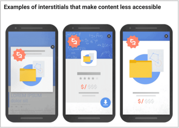
Large, full-screen pop-ups are another major accessibility issue, as they can prevent users with limitations from interacting:
Use a Website Accessibility Checker to quickly surface accessibility gaps based on the Web Content Accessibility Guidelines (WCAG), especially for forms, navigation, and interactive elements.
Nothing breaks trust faster than hitting a dead end.
Sometimes, visitors click links expecting continuity, but instead get 404 errors. They find advice that references outdated stats or tools. Related content is stale or missing. The site feels neglected. That fragmented journey makes people doubt authority and leaves them unsure of what to do next.
Broken links and outdated content hurt both perception and performance.
Visitors often feel frustrated when they encounter a 404 page, expecting to see something else. This can cause them to bounce, losing their trust and prompting them to look elsewhere.
For search engines, orphaned pages often mean outdated content and declining link equity. Search engines and generative AI platforms value up-to-date content. That means pages with proper redirects, coherent content clusters, and topic relevance to keep users engaged.
And it’s not only just about broken links either. If your website offers a lead magnet or an email opt-in, make sure it’s up to date and functioning properly.
Marketing messaging should match throughout, too. For example, a pop-up might promote a digital product. And it reads like this is a free lead magnet. But when clicking on the download button, it takes them to an order page with a non-zero price.
This is a bad user experience and immediately erodes trust.
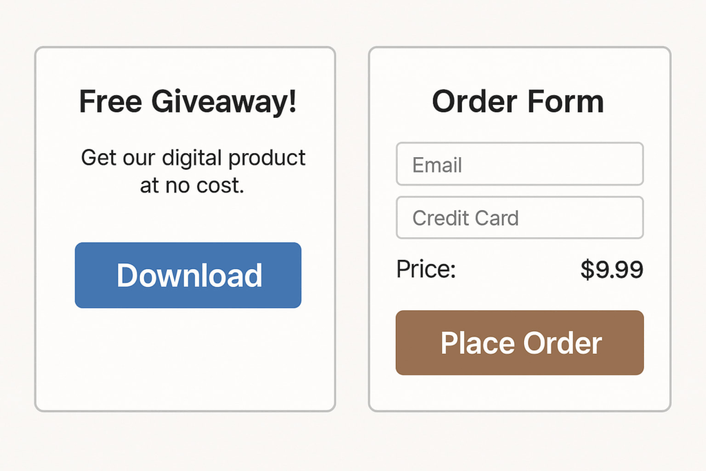
Image created by the author
Curious about building and leveraging authentic trust signals? Read more about how to build brand trust with content marketing.
Pages with too many signals leave visitors stuck.
Multiple buttons, vague asks, clashing fonts, and ungrouped blocks force people to pause. They don’t know where to look, what’s next, or what matters.
The result: decision paralysis.
Even if the offer is strong, too many signals can trigger confusion, causing users to leave without completing the intended action. That fragmented flow dilutes momentum and wastes traffic.
Cognitive overload drains mental bandwidth. Humans can only hold a few pieces of information in working memory. When designs ignore that, users may become overwhelmed and abandon.
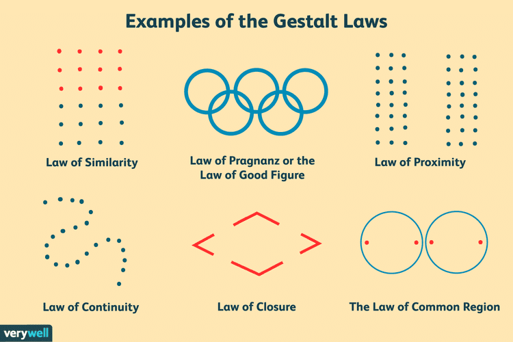
Applying Gestalt principles (e.g., grouping, proximity, similarity) helps users parse content faster and make sense of the layout.
Clear hierarchy and reduced noise cut the friction. At the same time, unclear or competing calls to action (CTAs) scatter intent.
Conversion research shows that a single dominant, benefit-driven CTA outperforms vague multipliers. The numbers may vary, but for example, research by Unbounce shows that one clear CTA per page drastically increases conversions.
Sequencing content and tapping the Zeigarnik Effect—showing partial progress or breaking tasks into steps—keeps people mentally hooked and reduces drop-off.
Personas matter too. When the message and ask align with the audience’s intent, the flow feels natural instead of disjointed.
Fixing the core leaks in your WordPress user experience provides the highest leverage for increasing traffic, engagement, and conversions. Focus on the top complaints, such as speed, clarity, mobile responsiveness, and trust signals.
These user experience tweaks shape how real people perceive and interact with your content.
Run a quick audit, prioritize the handful of issues above, and bundle your findings into an actionable deliverable. And while you’re doing that, did you know you can also optimize your content workflow to publish faster? With Wordable, you can update stale content and publish new pieces faster by writing like a Google Doc. Try it out today!