

Calls to action became an integral part of conversion strategies for many online businesses and the effects of call-to-action buttons have been proven time after time.
They’ve been so effective for quite some time, that they are now anchored in marketing in terms of being a factor in a successful campaign. CTA is an element that should be carefully planned and tested before going public.
The purpose of a CTA is to catch the attention of the audience and drive them to take action. If it doesn’t have a good click-through rate (CTR) then it’s time for a change.
Another factor for the low success of your CTA’s might be that the consumers are becoming more knowledgeable than ever. They’ve become accustomed to some of the most common tricks and methods.
That’s why it’s important to adapt to current changes, which means that it’s probably time to consider changing your CTA strategy. CTA’s like “Buy Now” might be too pushy for today’s consumers that are more solution-oriented and need more convincing before they make a purchase. In this article, we’ll talk about why to avoid it, how to build a great CTA and go through some good examples used by other brands.
Effortlessly export your Google Docs to WordPress with just 1-click.
Get Started Today
As mentioned, consumers are becoming sharper and the common CTA’s such as “Buy Now” might not get the desired results. They rarely come to your lead magnet page fully equipped with all the information, so a bossy CTA might push them away.
Your CTA should always be focused on the benefit. Try to emphasize what the reader gets (after reading your content), instead of what they’re giving. “Buy Now” easily sounds like an invitation for the reader to come and spend their money on your website.
If you are selling a product or service, your focus is on selling a significant number, and for you, the perfect action a reader can take is to make a purchase. But, your reader’s interest is quite different. What they’re looking for is how to get all the information they need to decide whether to give you their money.
So to be clear — steer away from CTA’s that make it seem like the reader has to give, instead of get any value. We’ll cover some examples later on. First, let’s dive into the thought process when creating a killer CTA.
Creating any content on your website should have a purpose. When composing website copy or writing a blog post, you should have a picture in your mind, what you want the reader to do when they are finished reading. In order to create a successful CTA with a high conversion, you should determine your primary goals.
Instead of Buy now, your goal-driven CTA’s could be:
It depends on your business, but you will usually have more than a few goals.
It’s important to decide which ones are key for you. After that, it’s easier to start thinking of a copy that presents the benefits the reader gets, and what actions you want them to take.
Creating an effective CTA isn’t rocket science. If you follow the basic rules, you’re already on the right path. We can’t tell you exactly what CTA to use, since there are a lot of different factors to include. But, we can enlighten you with some basic rules to follow.
Maybe consumers evolved and some trends have changed, but the human psyche has essentially stayed the same.
They still read in the first person, they’ll always want to get something from you, for free if possible, and they can be a bit scared they might miss out on an opportunity. Considering this we suggest you follow these 4 basic tips on how to create a great CTA:
There is no room for confusing messages here. Be direct and straightforward when using a CTA, and don’t forget to say what the reader is getting from clicking on that button.
You should always aim to provoke enthusiasm and eagerness in the consumer’s mind.
“Call us now” can be used as simple and direct, yet a great example. It has the verb that calls for action and has the urgency of the adverb “now”. Users may not have the time to read the full page, or they’d just like to talk to a real person before deciding to give you their money.
Try different types of CTAs to understand what works best for you. GIFs, QR codes (use one of these best QR code generators to create one), and other elements could work as CTAs.
Be direct about the action your reader needs to take. Combine the action using a verb, with the benefit their getting. Something like — “Unlock my offer”, contains a verb that sparks action in a very appealing way.
You need to communicate well in order to create conversions, so think of something simple and catchy. Also, this example is written in the first-person perspective, which is our next basic rule.
Most of the time consumers are alone with their thoughts when they’re encountering your website or ad. When they’re thinking to themselves they do it in the first person. So, why not write the CTA in the first person so they feel like THEY are entitled to something or have taken something from you.
We mentioned the “Unlock my offer” CTA. This is a great example as the reader could think that the offer is already there for them to take. All they need is to “Unlock” it!
Let’s stick to the previous example. Add an adverb of time to it so the reader feels as if this is an instantaneous opportunity.
“Unlock my offer today” makes it seem like it’s only available today. The reader needs to take action before the offer expires. That urgency can provoke your targeted consumer to make a decision, in your favor.
Depending on your goals, you should create content that flows right into the hands of a strong CTA, such as leading users to a certain landing page.
On the other hand, some goals are always active, combined with a simple copy. A good example of that is inviting people to sign up for your newsletter. If that isn’t a primary goal, there’s no need for it to have a pop-up covering most of the page.
Considering there are different factors, we’ve created a list of CTA placements that vary from goal to goal:
These are some of the examples for your CTA placements, but it all depends on your goals and targets. Let’s talk about some real CTA examples.
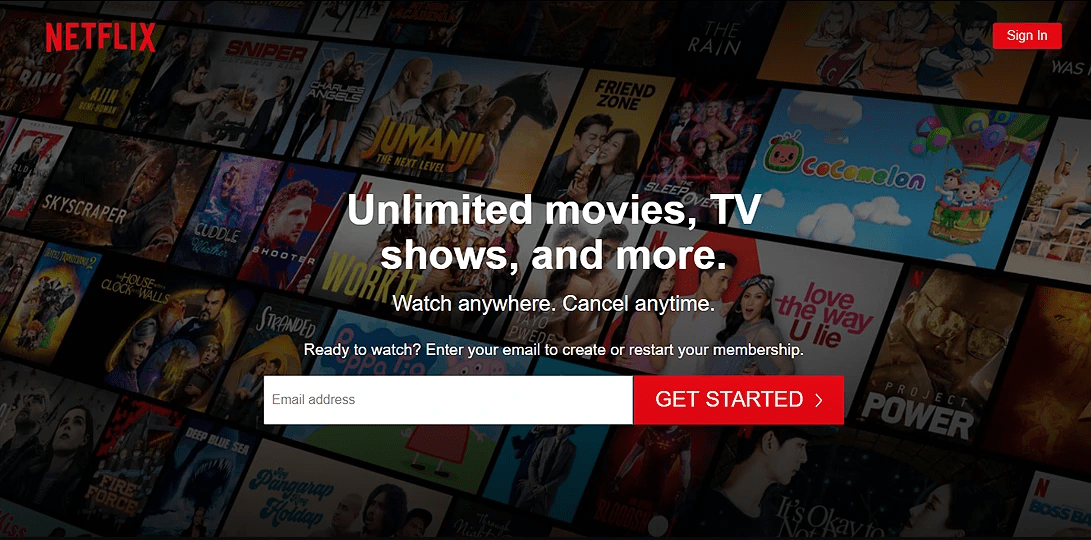
The popular streaming service uses the common CTA — Get Started to get you to sign up for a free trial. The difference-maker for them is that they add “Cancel anytime” so as it seems there is no risk related to their offer.
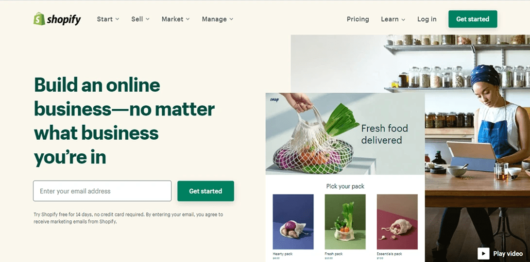
Another great example of combining two different CTA’s. They also use a common Get started CTA, but in the copy above they focus on provoking emotions and enthusiasm — “Build an online business — no matter what business you’re in”.
It’s simple, it hits right on the target for any aspiring entrepreneur, who just needs a little bit of help.

This brand is a great example of a unique CTA combined with a more common one. The primary highlighted CTA says “Choose your BarkBox” and the secondary one says “Give a gift”.
Either of these CTA buttons is used for conversions but in a different way. They’re presented as if the reader is in the power of making a choice, but both options result in a conversion for the brand. Home run!
Call-to-action is a proven method for getting more conversions. It can be a great tool if used the right way. Average advertisement viewer notices the patterns when they’re used often. That’s why CTA’s such as “Buy now” could be flagged in the reader’s mind as a sign that someone wants their money.
This is why it’s important to create such CTAs that are direct, simple, and yell out loud all the benefits and its features. Use verbs and adverbs and try to set it up so that the reader can read in the first person. “Unlock my offer” is a great example we’ve mentioned.
We believe that when you determine your goals and create content that’s in relation to it, the CTA’s will come themselves. Follow the basic rules we’ve talked about above, and you’ll be on the right path!