

Imagine the engagement of your WordPress blog skyrocketing just because you tweaked a few things in the user experience department. Sounds like a marketer’s dream, right? Well, buckle up — we have seven tips from UX experts to help you turn the dream into reality.
How? 🤔
Recent research from Forrester found that, on average, every dollar invested into UX earns 100 in return 📈. That’s a mind-blowing return on investment of 9,900%. Does that sound like the sketchy “investment opportunity” your cousin has been telling you about?
Here’s another interesting case study: Have you ever heard about the story of the 300 million-dollar button? Jared Spool, the world-renowned usability and user interface design guru, has a famous article explaining how tweaking the user experience of a large e-commerce site by changing one button (yeah, you heard that right – one button) increased annual revenues by $300 million!💰
By now, the importance of optimizing the user experience on your blog should be obvious, but you might wonder:
Effortlessly export your Google Docs to WordPress with just 1-click.
Get Started Today
Good user experience is crucial for a WordPress blog (or any other CMS or product) to succeed. Great WordPress blog user experience will make your blog easier to use, help your blog rank higher on search engines, and attract and convert more visitors.
User experience (UX) defines your overall experience when using and interacting with a product or service. This includes the perceived usability and the emotions you feel during and after the interaction.
Interactions with websites, mobile apps, or blogs where we consume content also contribute to UX. A WordPress blog with good UX needs to accomplish the following:
1. Help meet consumers’ needs and solve their problems.
3. Be easy to find and navigate.
4. Look credible and trustworthy.
5. Be desirable and evoke positive emotions in users.
6. Accessible for everyone (don’t forget about people with disabilities).
7. It must provide value to the user.
At first sight, these statements are a bit too obvious and applicable everywhere. But how can we ensure this when creating a blog on WordPress?
Readable content is a cornerstone of a great blog user experience. Here are the basics you always need to keep in mind:
Let’s face it – people usually scan the text instead of reading it (ain’t nobody got time for that). Therefore, your goal is to make the reader see the most important information without losing the logical connection and context, and here is how ⬇️
The world-renowned UX research agency Nielson and Norman Group used eye-tracking to evaluate how people looked at thousands of web pages. They found out that people use F-Shaped Patterns For Reading Web Content.
When users scan blocks of text, they start horizontally along the top part of the content. This is followed by a shorter horizontal movement a little further down and then vertically down the left side of the text – making an F pattern.
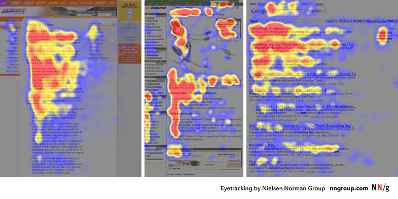
(Image Source: Nielsen Norman Group)
How can you implement the F-shaped pattern into your blog?
Semrush implemented the F-shaped pattern into their blog and saw an astonishing 64% increase in non-branded organic traffic. Remember this for your next posts, and use Google Analytics to track the impact and benchmark the performance of your blog.
In UX design, visual hierarchy helps guide the users’ attention and create a good experience. It involves organizing elements to show their importance, relationships, and flow of information. Here are the key principles and components of visual hierarchy in UX:
Expert tip 👨💻:
“You can use website heatmaps to learn how users click, what they see, and what catches their attention most. Heatmaps aggregate users’ interactions such as scrolling, clicks, and cursor movement on the blog and visualize it. This can help you uncover issues such as that over 80% of your readers never see your main CTA as they don’t scroll down the page enough or they try clicking on non-clickable elements. “ – Tadeas Adamjak, UX and SEO consultant
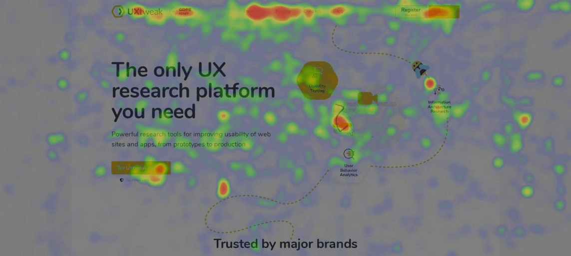
Here’s an example of a Cursor Movement Heatmap – studies show cursor movement relates to where our eyes look on a page. This means you can use heatmaps to evaluate which aspects of your page draw the most attention.
As more and more people use mobile devices to access websites, making your site mobile-friendly is essential. Ensure that your content is easily viewable and navigable on various screen sizes. Responsive design improves both user experience and SEO. You can run a mobile-friendly test to identify if any usability issues occurred.
Achieve optimal results with ease by:
Reading tip 📖: If you want to improve the SEO of your blog, make sure to use our WordPress SEO checklist.
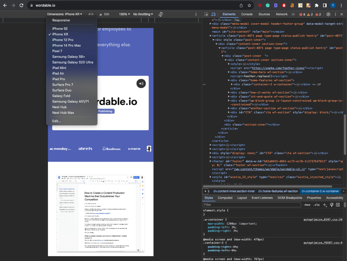
To quickly evaluate if your blog design is responsive and mobile-friendly, you can use the built-in functionality of your browser by following these simple steps:
Try answering the user’s intent – the goal behind visiting your article, as soon as possible. Don’t overload the article with extensive introductions, definitions, or unnecessary details. Use these content optimization tips to provide users with what they want.
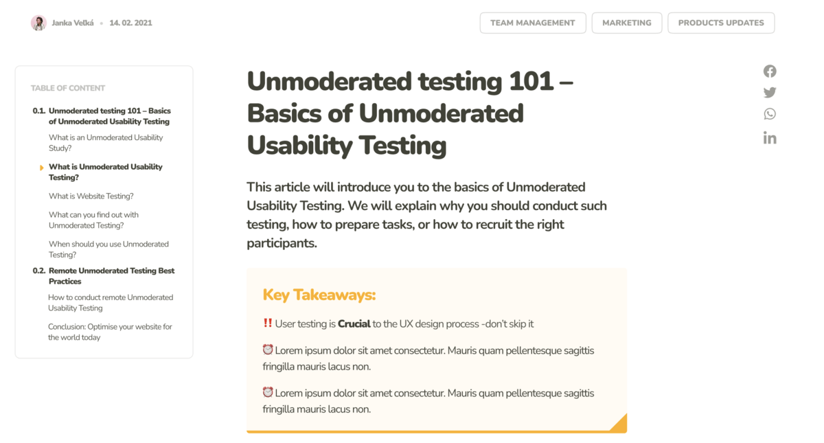
Tip💡: Use a table of contents (Wordable will generate it automatically) to simplify the navigation within the article and allow users to get to the parts they’re most interested in.
If you must include extensive information, add a Key Takeaways section or use Jumplinks.
Expert tip 👨💻:
”Try replacing the huge featured image on the top of your article with a smaller illustration on the side in the above-the-fold (or often called HERO) section of the blog (the part of your website that users see without having to scroll). This will allow your content to start sooner – hooking the visitor to read more. “ – Daria Krasovskay, Content Manager and Designer
Above is how LiveAgent implemented this tip in their WordPress blog, successfully lowering the bounce rate and increasing average engagement time and conversions on their blog posts.
Nobody enjoys entering a messy room, do they? The same goes for your blog. If filled with too much stuff, readers will leave quickly. That is where a modern and clean design comes in handy. It’s not just about following design trends — it significantly impacts performance. So, how can we start cleaning up our blog?
That cleanup should go beyond what readers can see. A blog can look simple on the surface, but still feel clunky if oversized images, extra plugins, or heavy page elements slow everything down. Treating speed optimization as part of the design process helps keep the experience clean, not just the layout.
Have you ever noticed that we tend to think pretty things work better? That isn’t just us being shallow. It’s another psychological phenomenon called the Aesthetic Usability Effect. Essentially, if your blog is aesthetically pleasing, users are more forgiving of minor hiccups and usability issues and stick around longer. Beauty is persuasive; remember this when your boss tells you that the design you had since the 90s will do fine for another few years.
Cognitive overload happens when too many tasks or much information overwhelms a person.
Making it difficult for their brain to process and understand it all. And that’s what happens when your blog is a visual circus. Too many elements, colors, fonts, and images competing for attention can confuse readers.
Your blog design should stick to clean lines, plenty of white space, and a color palette that doesn’t burn the eyes of the user.
Fonts? Keep them legible and classy. This simplicity helps your readers focus on what matters — your content. After all, that is why they are there.
Steve Krug, a Usability and User Experience expert, made several helpful points on avoiding cognitive overload in users in his book Don’t Make Me Think. We can implement some of these principles to optimize the design of your WordPress blogs:
Having great content is good, but ideally, it’s easy to find too. Think of a library with books all over the floor. You wouldn’t easily find the book you want, right?
Your blog is like a digital library and needs to be well-organized.
Try to group articles into clear, intuitive topics. This helps readers (and Google) find what they need – that doesn’t sound too hard, right?
But you need to remember the infamous saying: YOU ARE NOT THE USER – meaning that if you, your colleague, cat, or mum think you’ve categorized and labeled your blog intuitively, it doesn’t necessarily mean your readers will think that too.
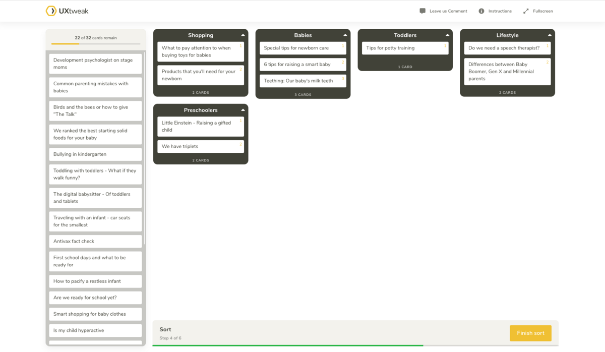
Enter the superhero of content organization: card sorting.
Here’s how it goes: you take your blog topics and write them on cards (or preferably use card sorting software because we’re fancy like that). Then, you ask real users to group these cards into categories that make sense to them. It’s like playing a matchmaker between your content and readers’ brains.
Once you have your card-sorting insights, it’s time to turn them into action. These user-generated categories become your blog’s navigation labels, categories, or menu items. It’s like rearranging your blog’s furniture according to how guests prefer to lounge.
Expert tip 👨💻:
“Try adding progress bars or reading progress indicators to your blog posts. It’s an effective way to keep your readers hooked and motivated to finish the article. When people see how much they’ve read and what’s left, they feel an urge to complete the task – in this case, reading your post.” – Marek Štrba, UX researcher and designer
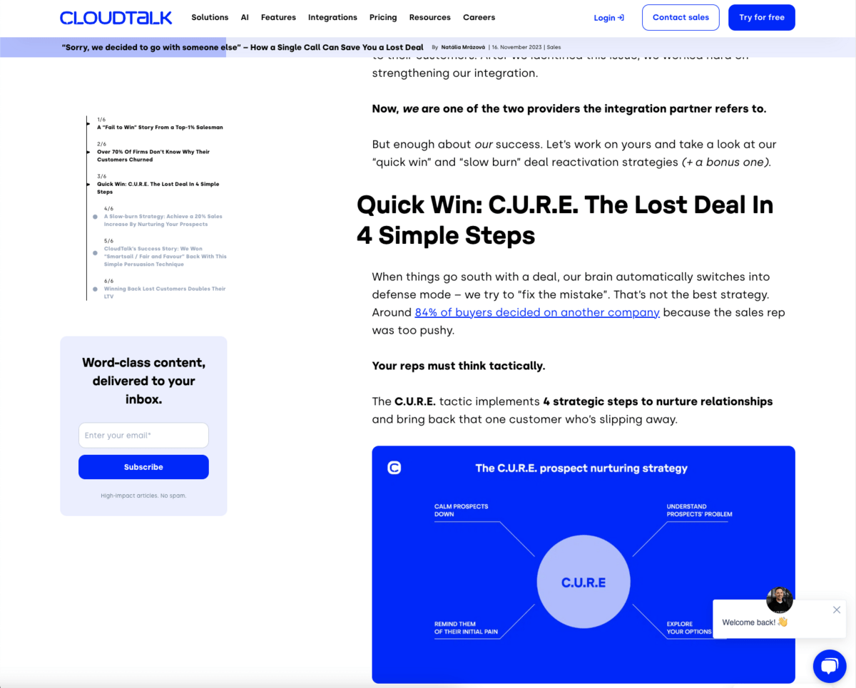
The psychology principle behind this tip is the Zeigarnik Effect, which suggests that people are more likely to complete a task if they know it’s unfinished.
We can find a great example of the Zeigarnik Effect on the Cloudtalk blog. In their article on how to save lost deals, they implemented a progress bar at the top of the page. They have also used the table of contents to display progress by highlighting the sections you’ve already read and displaying the remaining sections.
The website has to be accessible to everyone, including people with disabilities.
Here are areas you should always keep in mind:
Keep in mind that not all people have perfect vision. Be sure to use colorblind-friendly palettes and check the contrast of colors between the background and the text.
Also, try not to use #000 Black as the background with #FFF White as the text or vice versa. A black-and-white color scheme can cause eye strain when users read a longer text.
Apart from splitting your text into smaller sections and using bullet points, we recommend you stick to some of the most commonly used font families, such as Inter, Open Sans, Merriweather, and Helvetica. Don’t forget that the regular body text should be at least 16px to ensure the text will be easily readable.
You should be able to navigate your blog using a keyboard alone. This includes access to all interactive elements like links, buttons, and forms.
Use semantic HTML to structure your content, aiding screen readers in interpreting page structure. Don’t forget to add Alt text for images and labels for interactive elements.
Maintain a consistent and predictable navigation structure. Don’t use a horizontal navigation bar on some pages and a vertical sidebar on others – be CONSISTENT. Consistency helps users (especially the ones with cognitive disabilities) to navigate your site more effectively.
If you embed videos into your blog posts and provide captions and transcripts for audio content, this aids not only the hearing impaired but also those who prefer reading over listening or watching.
Regularly test your blog with various assistive technologies and gather user feedback from users with disabilities to continuously improve accessibility.
Try running through this checklist to determine whether your blog is accessible.
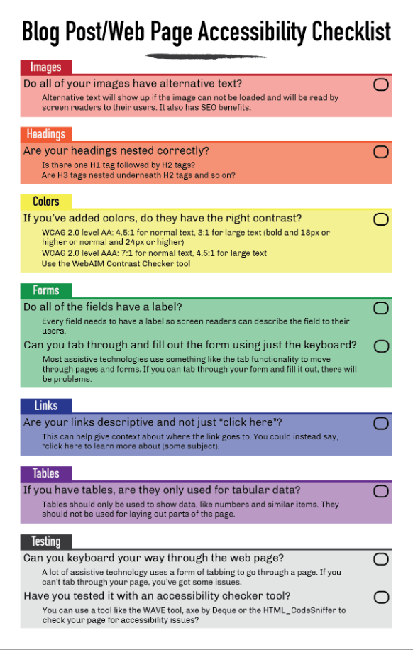
(Image Source: Jacob Martella)
Feedback and user testing are like having a heart-to-heart with your readers. You can learn a lot more than just figuring out if they like your font size. It’s about understanding their unique journeys through your blog, their needs, wants, and their aha moments.
If you listen to what your readers need and want and then deliver it – they won’t look elsewhere and will keep coming back.
Surveys and Questionnaires will be your best friends here. Keep them short, sweet, and to the point. Ask questions that explore the specifics, like: “What stopped you from finding what you needed?” or “How did our blog make you feel?”
You can also use user research tools to open up new learning opportunities such as:
Now that you’ve got all this juicy feedback and test results, what’s next? Analyze them for patterns. These are your action points — where you tweak, refine, and then, yes – test some more.
Expert tip 👨💻:
“In our thorough A/B testing experiments, we observed a significant rise in conversion rates when Call-to-Action (CTA) buttons were seamlessly incorporated into the blog content itself, as opposed to relying on pop-ups, sidebars, or top and bottom banners. This approach not only provides a more organic user experience but also addresses banner blindness, where users tend to unconsciously overlook content that resembles advertisements or appears in conventional ad placements.“– Tadeas Adamjak, UX and SEO consultant
Here’s an excellent example from Codeless – search engine optimization and content agency.
By embedding a CTA in context with the article’s content, for example, linking to a service mentioned in the text, as shown in the screenshot above, the CTA naturally aligns with the reader’s interest.
So, what are you waiting for? Get in on these UX tricks and watch your WordPress blog go from zero to hero. And remember, the only thing better than a good blog is an even better one. Consider conducting a UX audit if our tips seem too fundamental and you’re looking for a more in-depth approach. A proper audit will uncover deep usability issues holding your WordPress site back.