

Creating an infographic feels easy until you open Canva and get lost in endless templates. You spend hours tweaking fonts and squeezing in data, yet the final design still looks cluttered.
This is a problem because messy visuals don’t get shared. They get ignored.
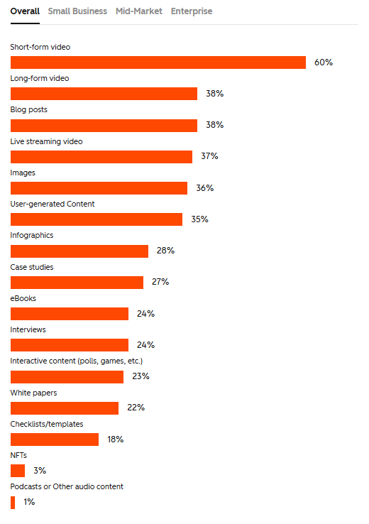
According to HubSpot, when it comes to content creation, 28% of marketers actively share infographics – so if yours isn’t clear, it’s competing in a format people already value but won’t engage with unless it’s done well.
The good news? Canva makes it much easier to create infographics that are clear, branded, and engaging – without needing advanced design skills.
Let’s take a closer look at how to create a Canva infographic that’s visually appealing and designed to boost shares.
Highlights
Infographics are visual stories that package complex information into quick, digestible chunks.
For marketers and educators, this makes them one of the most effective visual marketing tools. Infographics work because they’re clear, scannable visuals that anyone can understand.
Here’s what a strong infographic can do:
Presenting information in clear, digestible ways builds credibility.
And credibility increases sales.
As a recent paper in the Journal of Social Science, Economics, and Management found, infographics amplify campaign impact. They attract attention and are naturally shareable because people can grasp your point at a glance.
And because they’re easy to understand, potential customers trust your authority. This widens your reach, improves brand reputation, and encourages people to buy from you.
As FlippingBook’s visual marketing guide puts it …
“Well-crafted visual content can lead to higher conversion rates and improved ROI for marketing campaigns.”
But this is where Canva can really make a difference.
Canva helps you produce these graphics without needing graphic design skills.
Unlike heavy design software, Canva offers a simple browser-based infographic maker with a drag-and-drop editor that’s simple to learn. You get access to thousands of infographic templates and a rich content library that keeps every design consistent.
It’s a beginner-friendly tool with professional-level results.
So you’re convinced that Canva infographics are the way forward. But where do you start?
Before you dive into Canva’s templates, it helps to have a clear process.
Here’s a step-by-step approach to help you structure your infographics clearly, so they’re easy to read and align with your goals. 👇
Every infographic needs to start with one clear message. This directs how you craft the design and content.
So … what’s your message?
Are you showing survey results? Teaching a process? Summarizing research?
Write down a single sentence that sums up the aim of your Canva infographic.
This clarity matters because, while Canva offers hundreds of infographic templates, a template alone can’t fix unclear content.
If you don’t know what you’re trying to say, you’ll pick the wrong design style, and it won’t convey your message clearly.
For example, if you’re trying to show survey results, a statistical infographic with charts clearly highlights the data.
But if you put the same numbers into a timeline design, the story feels confusing.
The right format depends on the message you want your audience to take away.
Once you know your message, map out the content.
Infographics often follow one of five formats:
Creating an outline helps you pick a format that makes the data logical.
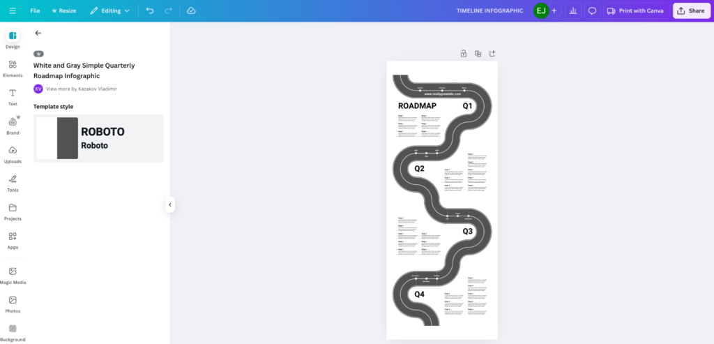
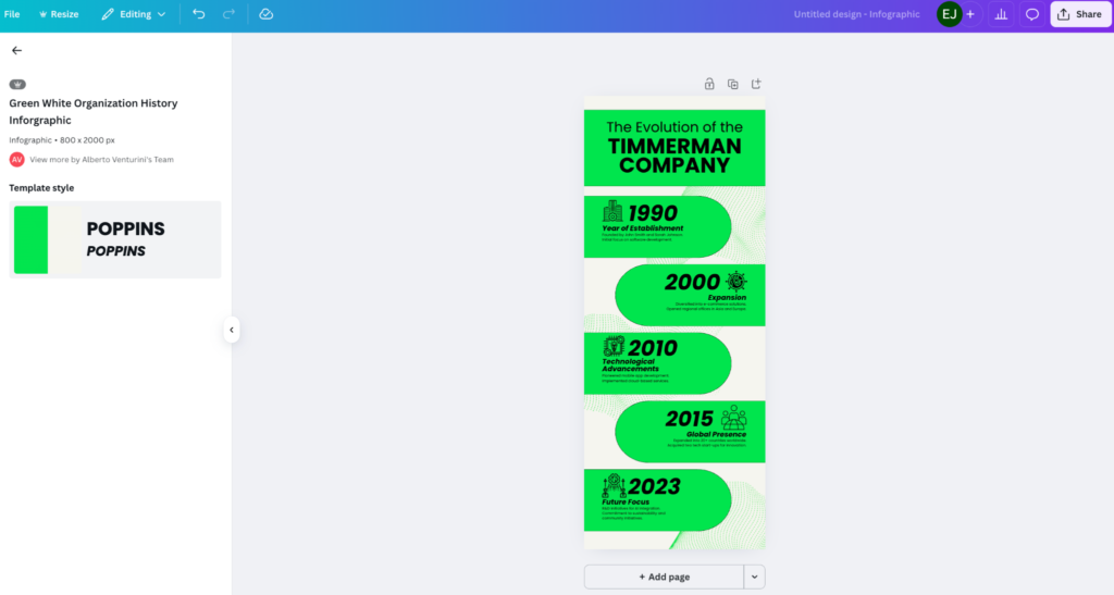
For example, this timeline template offers a sensible format for a business or product feature roadmap. 👇
Whereas this Canva template offers a better design to structure data on business performance. 👇
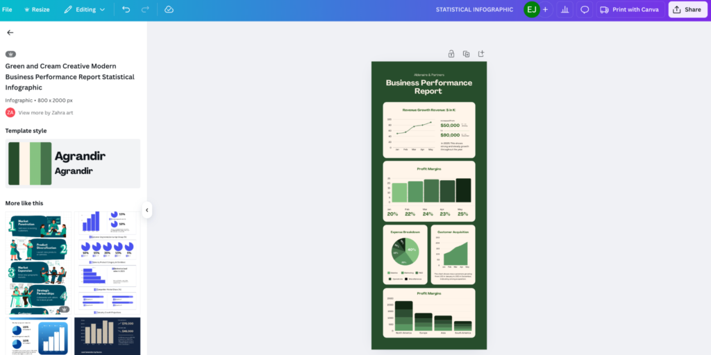
While both templates offer infographic designs, they’re very different.
This shows how important it is to clarify the structure of the information you’re trying to convey.
Now it’s time to pick an infographic template.
Canva has free options in its Apps Marketplace and premium templates with Canva Pro.
The trick? Pick a template that alreadymirrors your content flow. When a template starts to feel like a battle, that’s usually a sign it’s working against your message rather than with it.
For example, if your design needs to weigh two options side by side, a comparison infographic makes the differences clear.
For a workflow, a side-by-side format wouldn’t work. You’d need a process infographic with ordered steps.
*Pro-Tip: Save your favorite templates in your cloud workspace so your team can reuse them.
Yes, Canva has templates. But you don’t want your audience to think you copied them straight from the design platform.
Your infographic should mirror YOUR brand, not Canva’s.
This is where your brand colors, fonts, and logos shine.
Use Canva’s Brand Kit to upload your hex codes, logos, and fonts so you can design on-brand infographics without always having to search for the right hues and typefaces.
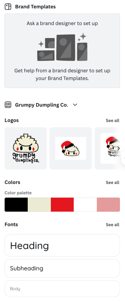
Once you’ve saved this, you and your team can use it to make sure every infographic matches your visual style without extra work. (PS: If you need to create infographics and other content assets at scale, you might need help from a content agency.)
Infographics are one of the best ways to help people visualize numbers.
Canva makes this incredibly easy with its built-in charts tool for bar, line, and pie charts. It also includes pictograms and custom icons from the content library.
Choose wisely so you can convey information correctly and create a design with visual appeal.
For example:
Remember, good visualization improves credibility. The way you design your data should help people learn.
A good infographic guides the eye from the headline to the takeaway.
Canva makes this easy with its array of typography tools and grid alignment.
To use these tools most effectively, follow these three rules:
Pair this with white space around key elements to avoid clutter. (Overcrowded infographics are hard to read, so keep them scannable to encourage users to stay on-page.)
Infographics are a blend of visual elements and supporting copy. But if you have too much text, it becomes a flyer. And if you have too many icons, it feels like a collage of pictures.
Aim for balanced visual chunks instead.
A quick way to test it: glance at your infographic for a few seconds. If your eye doesn’t land anywhere, or everything feels equally loud, something’s off.
Include short blocks of text paired with matching icons or charts. This keeps your story moving and improves readability on mobile devices.
For instance, check out this infographic by Quocirca.
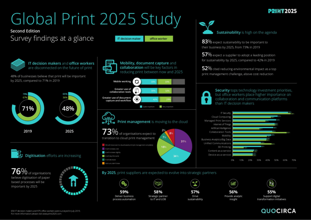
Notice how much information this infographic covers.
But instead of hiding the facts in long paragraphs, Quocirca highlights key points with charts and bold typography. At the same time, the design avoids visual clutter.
The text and visuals balance each other, so it’s both engaging and easy to read.
While Canva offers thousands of stock photos and icons, custom illustrations set your infographic apart.
(You can upload designs into the Uploads tab or create shapes with the online editor.)
Brands often mix stock images with unique graphic elements to show off their brand personality.
How you export affects shareability.
If your files are too large, viewers can’t share them on certain platforms. And if the resolution isn’t high enough, they won’t work in print.
Here’s a quick guide to exporting your Canva infographic in the right format:
Double-check the resolution in Canva’s file browser before exporting. A blurry infographic looks unprofessional, lowering your credibility.
*Pro-Tip: You can use Canva’s resize tool to update your infographic size based on the platform you’ll share it on. Canva will auto-create a new image with the updated adjustments. (Just make sure to edit it if it looks off!)
Before publishing, share your infographic with a small test audience.
Ask your focus group if they can determine the main message. If their answers don’t match your intent, you’ll need to head back to the drawing board.
This step helps you avoid miscommunication and ensures your design has strong UX principles.
Canva makes infographic design simple, but a few finishing touches often slip through the net.
This extra attention to detail separates a polished, professional infographic from one that gets ignored.
Here are a few best practices to keep in mind when designing Canva infographics. 👇
Your design needs to be inclusive.
Use high-contrast color palettes, clean fonts, and clear hierarchy so everyone can follow the story.
For instance, pale text on a white background might look trendy, but it reduces readability. This can exclude visually impaired readers.
Bold text and distinct icons improve your infographic for a wider audience.
This template offers a good example of this.
Notice the contrast between the highlighted graphics and the background? On top of that, the typography is bold, easy to read, and large enough for those with visual impairments.
Most people will view your infographic on mobile devices.
If your text is too small or the charts feel squeezed, readers will scroll past.
Test your design on a phone before you publish. If you have to pinch and zoom, adjust the layout to keep it simple.
Heavy files slow down sharing. A 5MB image might look sharp, but it won’t upload smoothly to social media platforms.
Canva’s export options let you compress your infographics while keeping the clarity. (For online use, aim for a PNG or JPG under 1MB so your infographic loads instantly.)
Infographics should connect with the rest of your visual marketing.
Use the same brand colors, fonts, and logos across all of your campaigns. A mismatched infographic feels off-brand, which can weaken trust.
Great infographics don’t stop at “publish.”
Track performance metrics like shares, downloads, and clicks to understand what resonates most with your audience.
(If a design with pie charts outperforms one with icons, double down on pie charts next time. And remember, Canva’s duplicate feature helps you test variations without starting from scratch.)
A Canva infographic offers your audience a visual story that communicates clearly and builds credibility.
When you start with a strong message, use structured templates, and apply smart design principles, your infographics can support everything from marketing campaigns to business proposals.
Now it’s your turn.
Open Canva, outline your story, and create an infographic to remember. ♥️
To make a free Canva infographic, you can use Canva’s free infographic templates and design tools. Simply sign up and start browsing infographic templates.
Upgrade to Canva Pro for more templates, custom branding, and extra storage.
The standard infographic size is 800×2000 pixels. But Canva lets you resize for social media, presentations, or print. Use its resize tool to format your infographic correctly for each platform you plan to post on.
Yes, you can add charts and graphs in Canva infographics. Canva includes a built-in chart tool for pie, bar, and line charts. You can also import data or use icons as visual aids.
Yes, Canva infographics are good for SEO. Infographics improve visual marketing by increasing shares and time on page. They can also help with backlinks, since other sites will naturally want to share your new resource. (These backlinks improve your Google rankings and domain authority.)
Marketing teams, higher education, non-profit organizations, and businesses across sectors use infographics for knowledge transfer, training, and campaigns.